NYC: New York Crashes
Staying Safe in the Big Apple
William Ambrosetti, Alexandra Biddiscombe, Youssef Sedra
Introduction
In this project we intend to explore the most dangerous aspects of one of man’s creations: cars.
As a very prominent part of our daily lives, and the closest example to a mech we have readily available, cars and any type of motorvehicle can be very dangerous, both to their occupants and to pedestrians.
Our objectives are to find the most dangerous aspects of these machines, by taking the example of a big city and studying the crashes that take place inside its borders.
Why Car Crashes?
When looking at the subject “man-made”, not much is more eye-catching than a flashy mech, driving at hundreds of kilometers an hour. Also motorvehicle crashes are the second largest cause of accidental deaths, and even though these numbers keep going down each year, there’s still enough accidents to be constantly on the news and floating around our subconcious.
Why New York?
New York City was selected as our city of choice for this purpose, because it is well-known as a tourist attraction and disposes of complete data sources, and not due to any outliers in the number of collisions in this region as opposed to any other.
Data visualizations
We want to find the most dangerous areas to be, the most dangerous time to wander the city, and the vehicles likely to cause the most danger, so as to be able to navigate the streets more safely.
First of all, before answering these questions, let’s see what kind of data we have, by performing one initial simple visualisation.
Below is a scatterplot containing every crash in NYC between 2014 and 2024, using longitude and latitude, with fatal crashes depicted as red crosses.
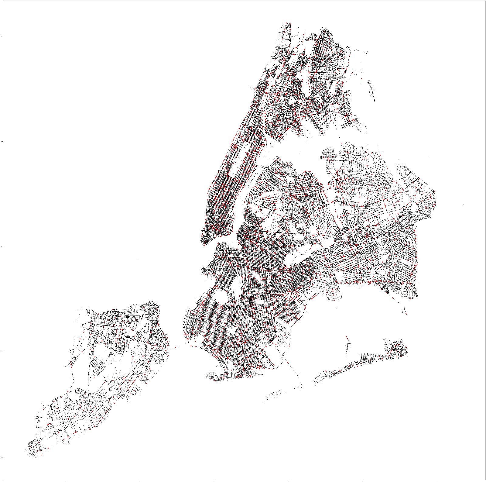
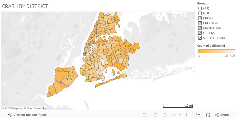
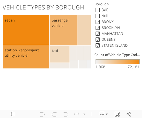
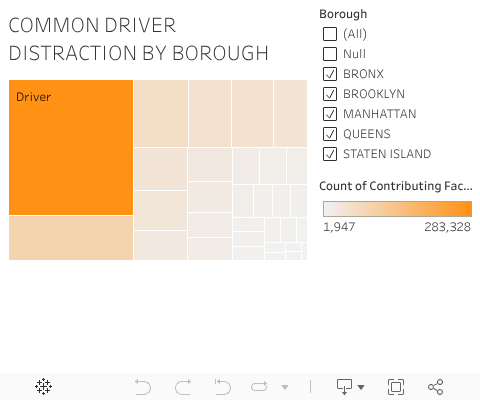
New York Crashes: The Where and the Why
With this first data visualisation we want to answer the questions:
- “Where, as a citizen or tourist, am I most likely to be in danger when traveling through NYC?”
- “What is most likely to cause that danger?”
You can find the answers by selecting a view of all boroughs of NYC, or by selecting a specific one on each graph by ticking its respective box.
New York Crashes: The When
The second visualisation is aimed at answering:
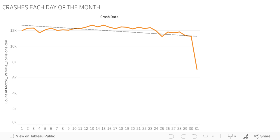
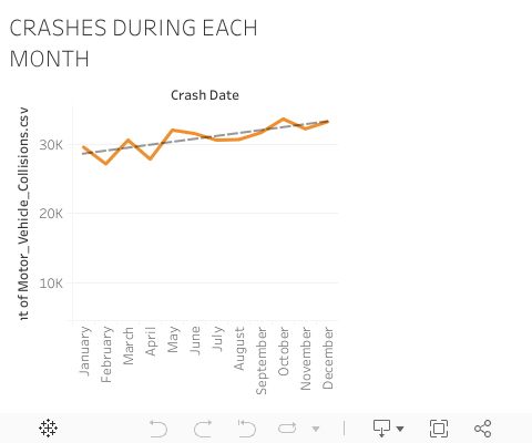
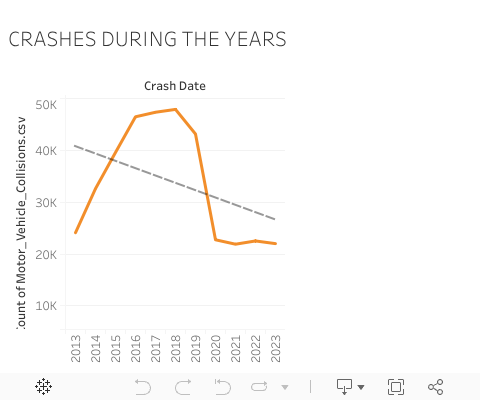
- “When do most accidents occur in NYC?”
To adequately answer this question, there is a selection of different timeframes that should showcase the daily, monthly, and yearly change in accident frequency. To find the differences between these, below are some graphs that showcase the total number of crashes over the years. Keep in mind for the daily view, that there is a significant drop due to some months having different lengths, not because nobody has any accidents on the 31st on purpose.